2017
Crowdsourcing Movie AppI worked as lead designer on this project alongside stakeholders and developers to create a new brand and prototype for this entrepreneurial mobile app. I worked to create their brand’s look and feel, the design for their system a clickable prototype, interaction animation videos and other pieces of collateral they might use in their quest for funding.
Project Overview
The client for this project was kicking off an exciting new app idea and came to us for help. The app would put the power of going to the cinema in the user’s hands. Leveraging the social nature of today’s world, the client wanted to offer users a system in which they could propose movies to be shown at specific locations at specific times. Those users would then compete with other proposals to win the final slot.
Core Feature Ideation
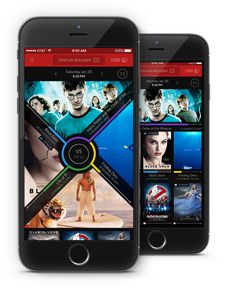
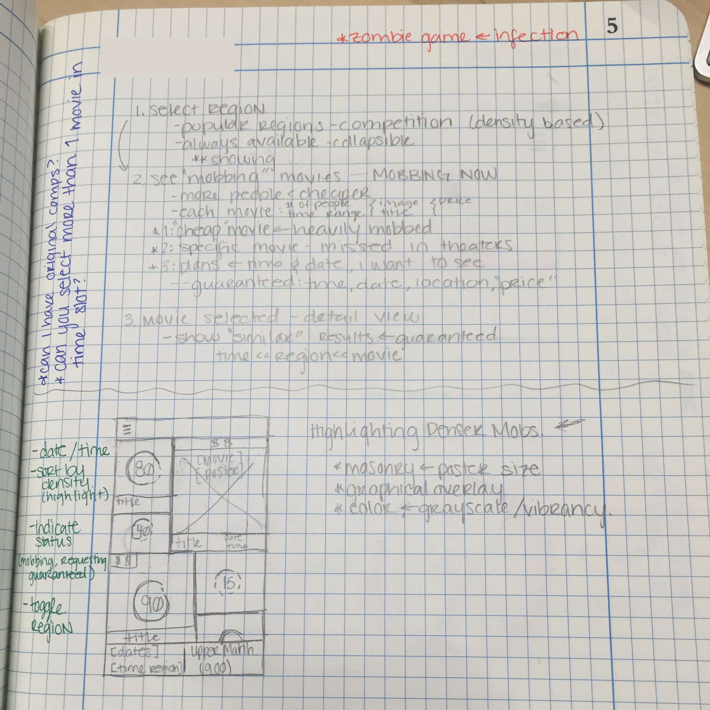
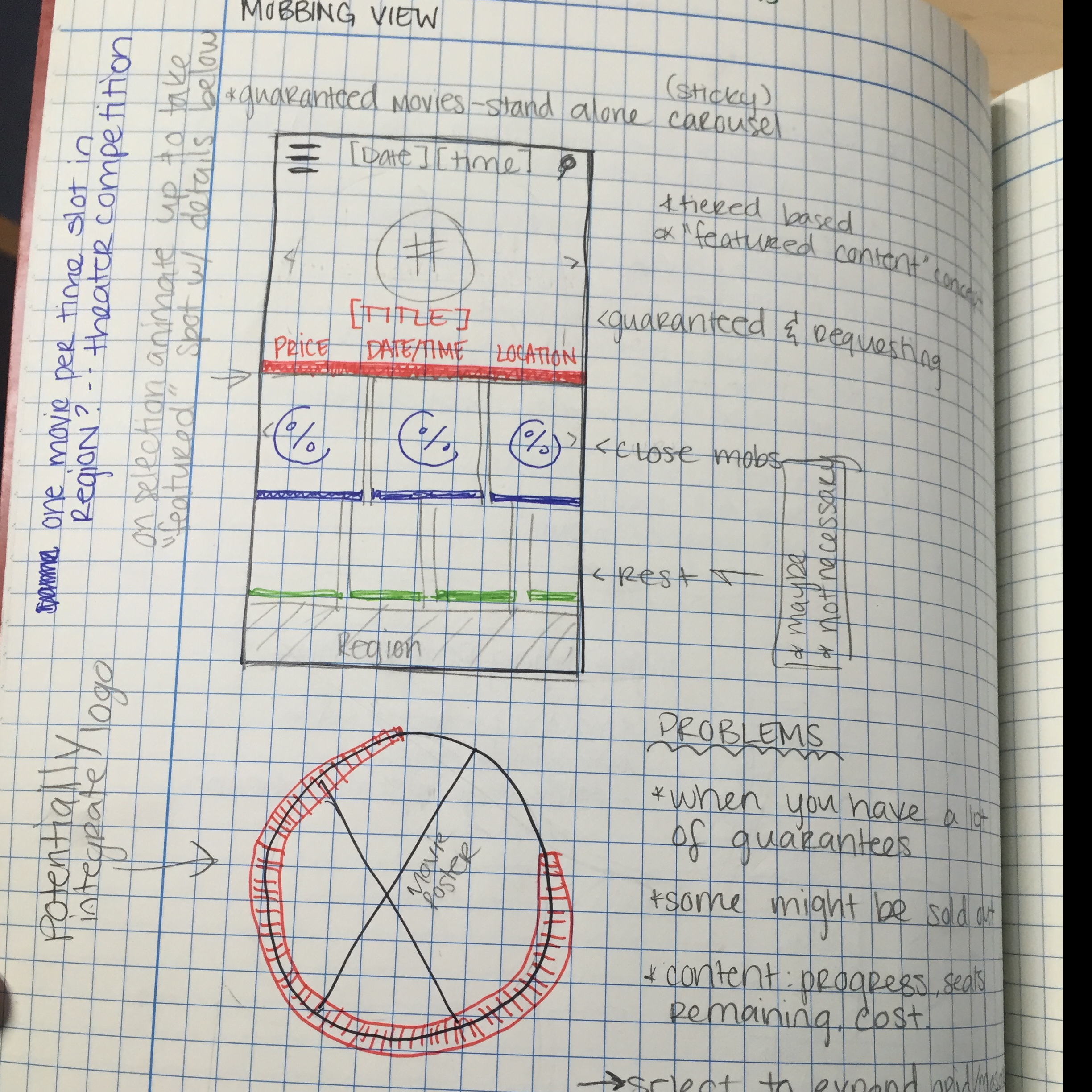
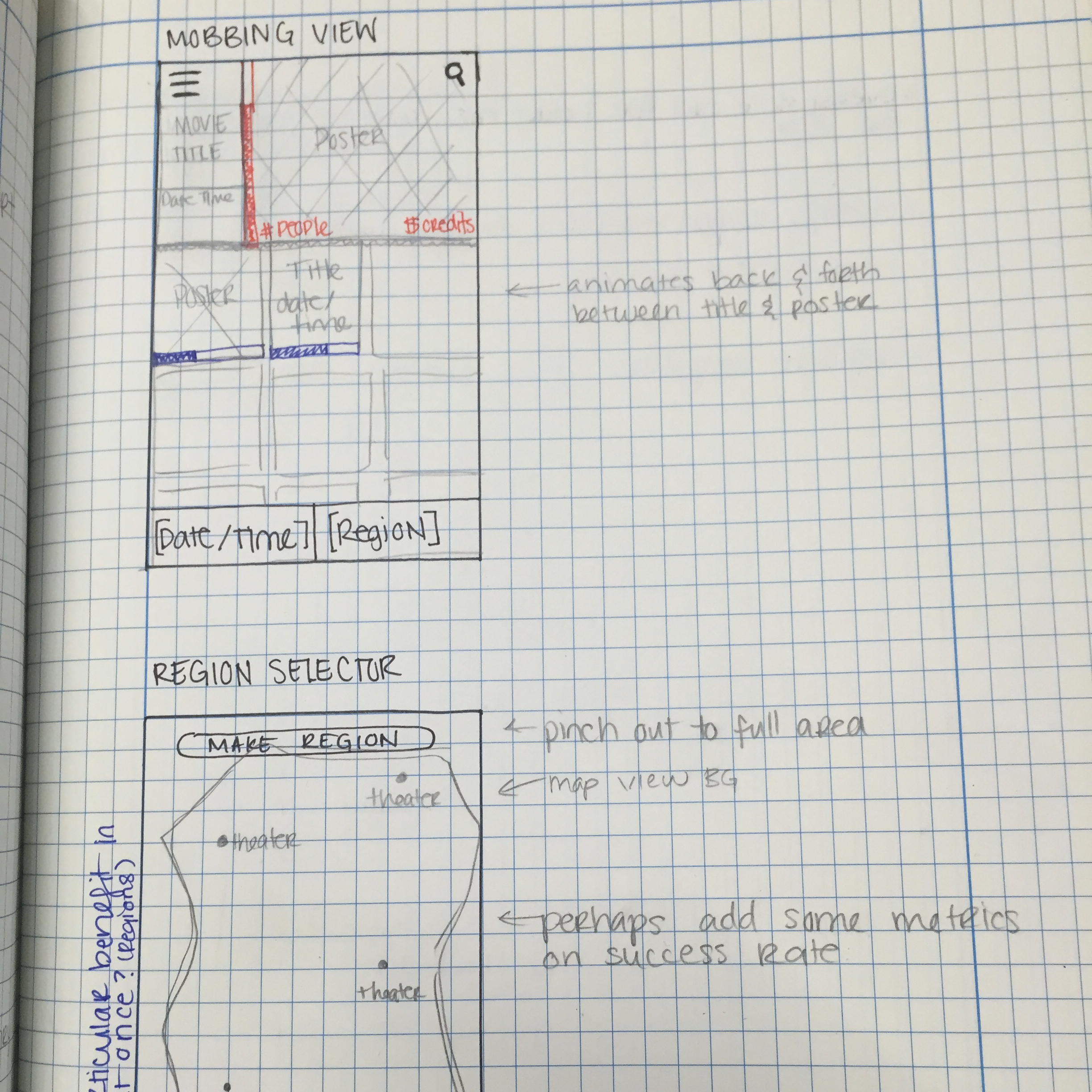
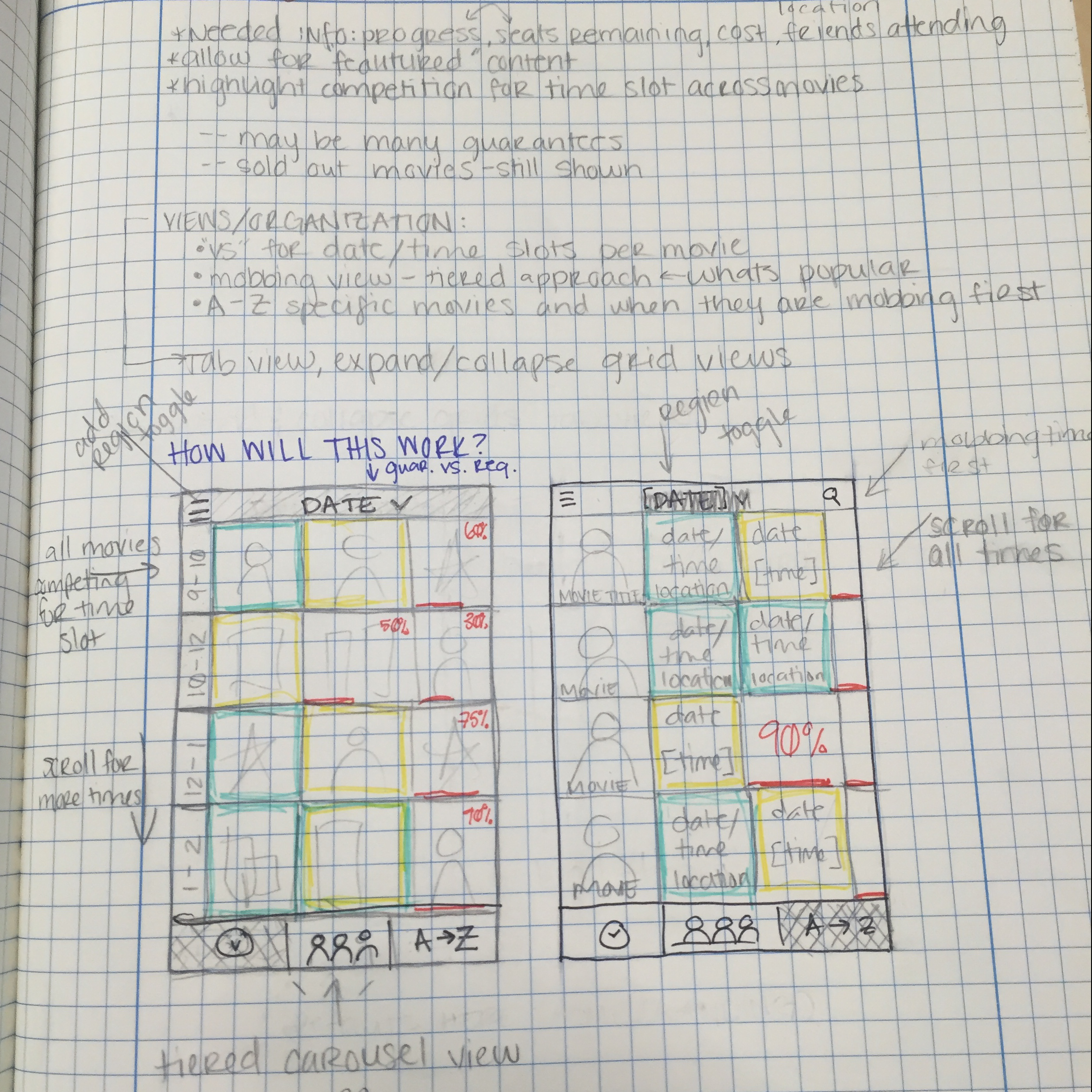
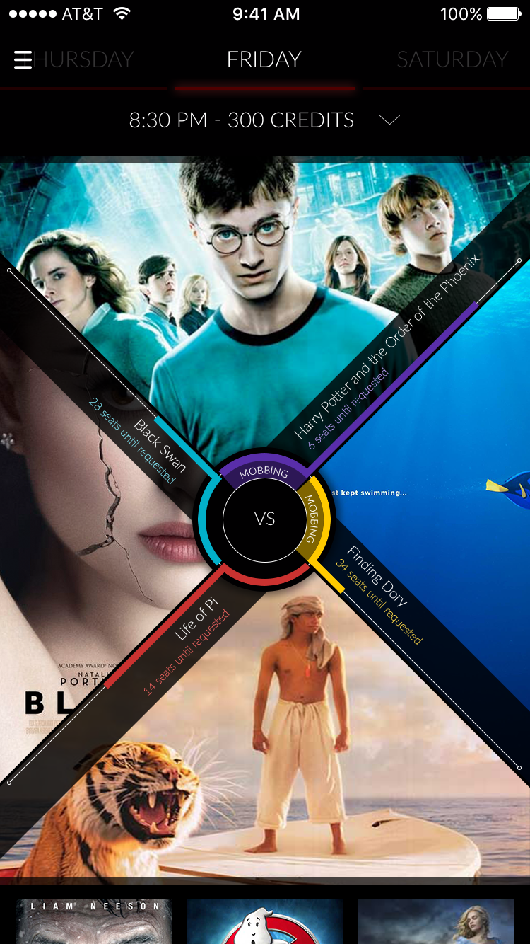
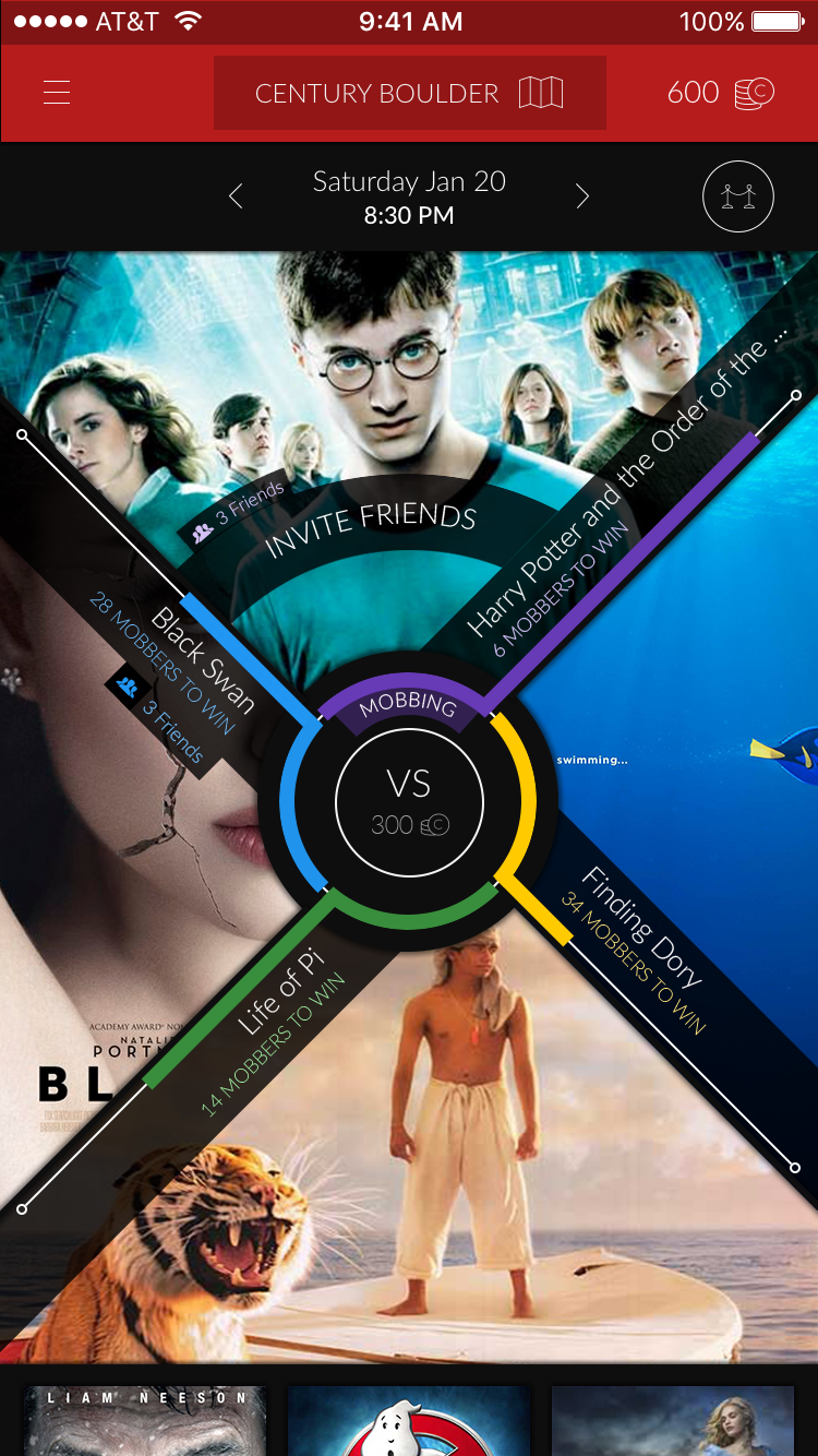
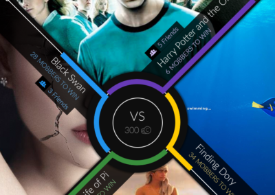
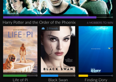
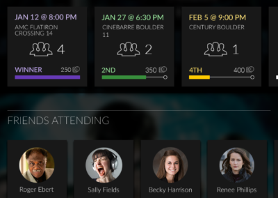
The client wanted a UI that was bold and different, something that would stand out and be fun to interact with. Taking this direction, we agreed that the core feature – the “mob race” as we called the competition – needed to pack the main punch. So I took this component, needing to show: all the candidates, who was winning and by how much, and the time slot in question, and played with a bunch of different candidates.
ideation, notes, sketches
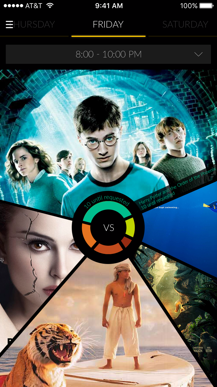
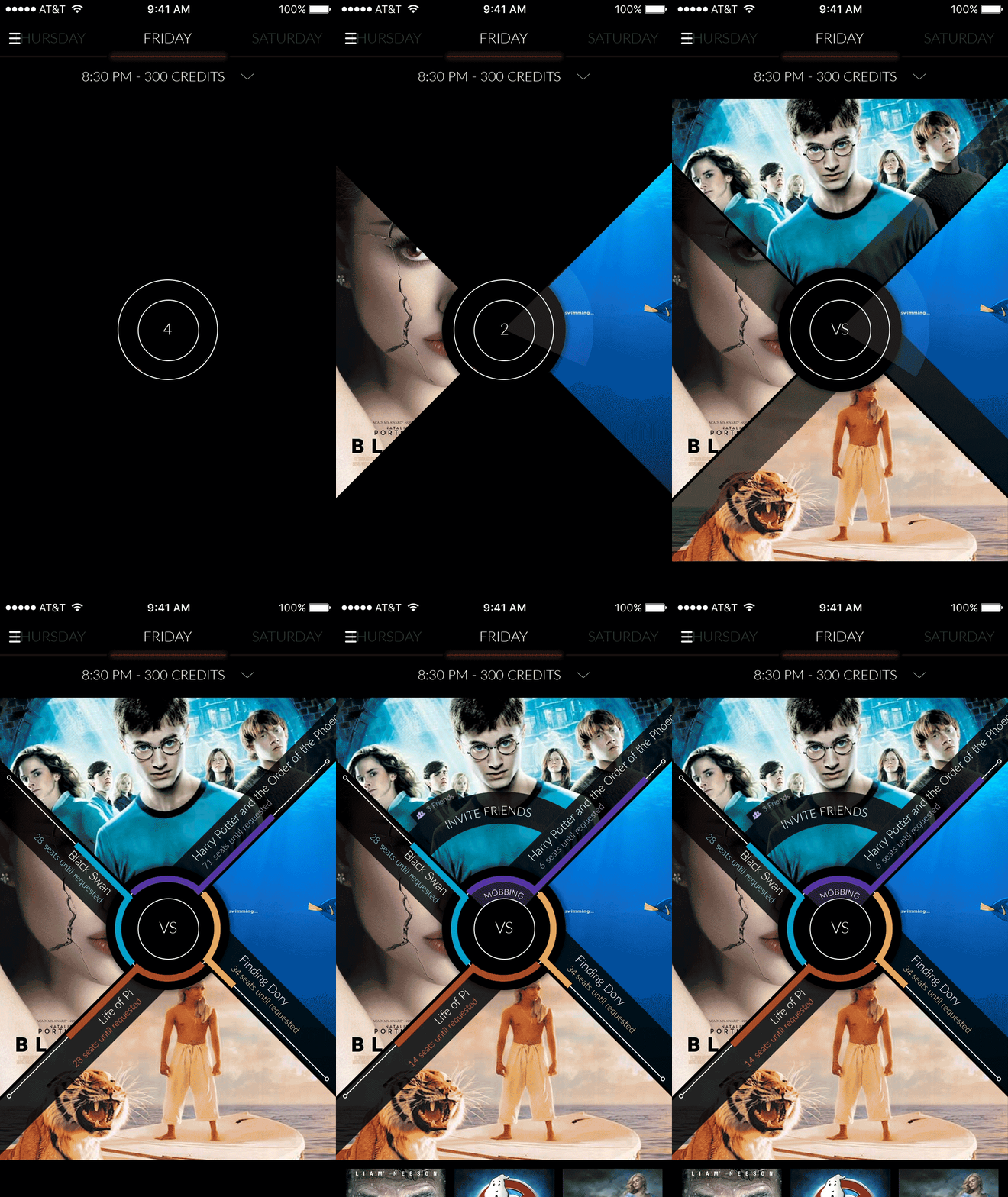
I played around with a masonry view, where the tile’s size would correlate to its place in the running – or perhaps we could utilize animations to smoothly drop the options into a tiered layout. I played with some more fluid, organic options that could work more like a heatmap. It was important, all the while to consider how this design might pull back into its surrounding UI features, how do you step into the specific time slot’s competition, are there micro ways we might show the race that mirror the design, etc. We eventually landed on a percentage-based approach where movies compete with screen space and the winner’s poster will slowly fill the entire view. To fully realize what this screen could be, with the help of my animation-skilled partner – we put together the animation below. This felt dynamic and exciting, while still carrying some of the nostalgia in film of the traditional Film Leader – used to assist in threading projectors.
competition screen iterations
Information Architecture
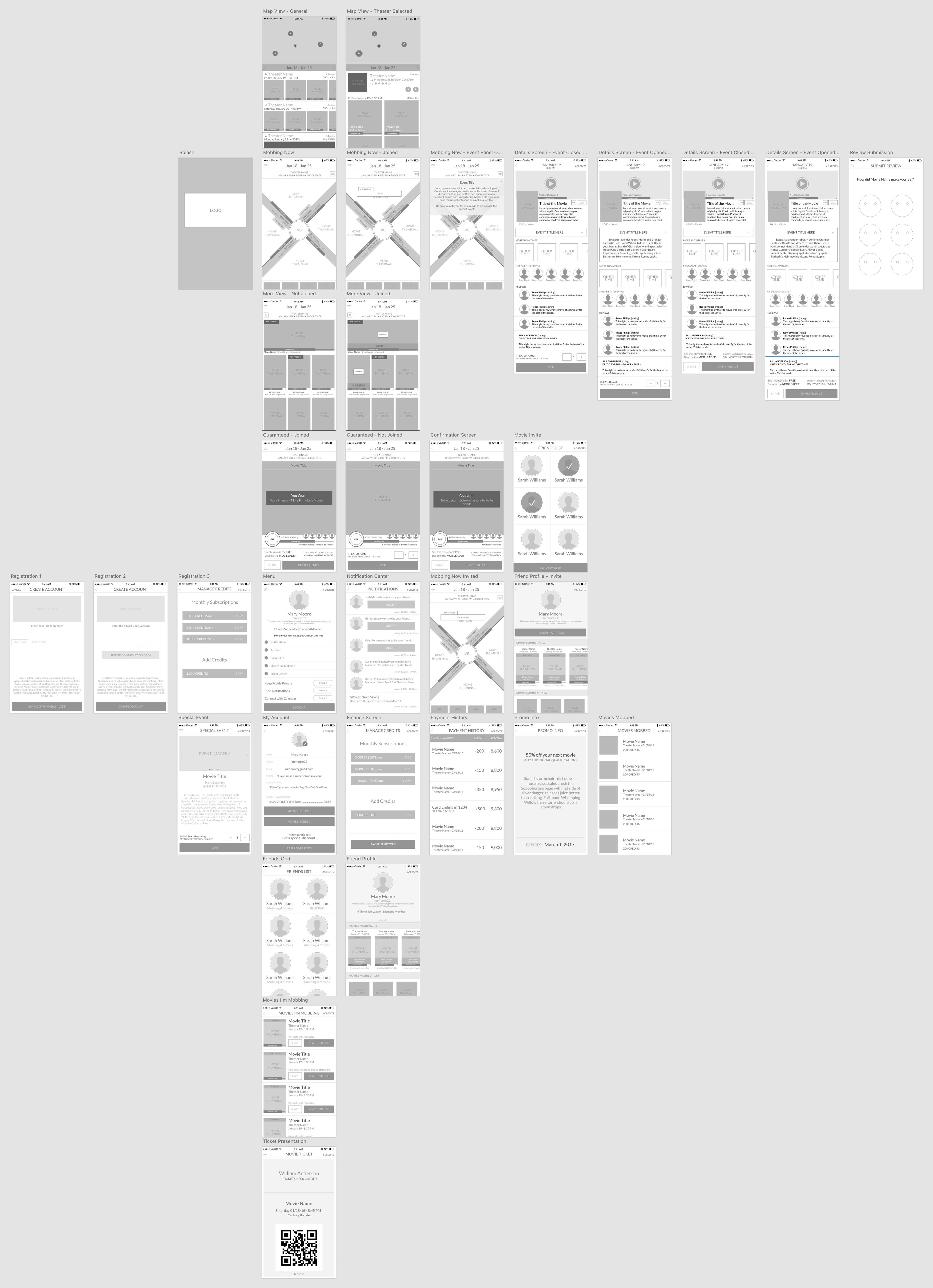
With the key component’s UI fleshed out and finalized, the next step was to collect all the features of the MVP and organize them through the hierarchy of the user’s needs.
Dropping the user directly into a competition near them will reduce the barrier to entry and provide immediate context and value. From there, a user can hone in on their desired time and location in order to find a competition they are interested in.
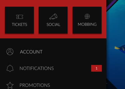
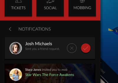
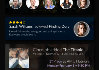
All other secondary interactions can be found in the navigation drawer, wherein a user can quickly access more single-use secondary content like their “tickets”, their friends activity in “social”, or back to the competition screens in “mobbing”. Beyond that, all tertiary screens like settings, promotions and notifications are found via the list view and are contained to the drawer.
Branding
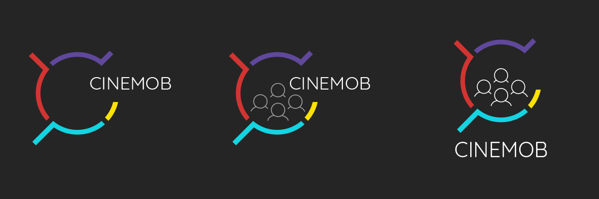
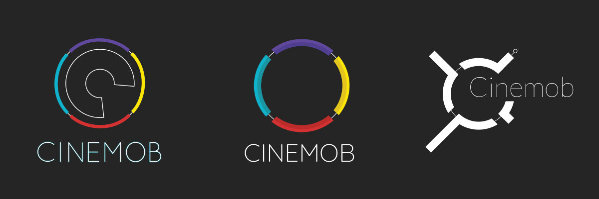
Now that the system was ready for design, it was time to spend some time defining the brand and developing a logo that would set the tone for the app’s visual language. We knew that the goal was to for the logo to be bold, unique and to compliment the brand name which carries quite a bit of visual weight itself.
I felt that the logo should leverage the work we had done to define a strong and unique UI for the competition component to emphasize its importance. I also played around with integrating some social elements or further push the movie aspect. Ultimately, we landed on a clean wordmark with a simplified version of the competition control. This gave us flexibility to use the full logo, the versus control in isolation, or the word in isolation.
Final Prototype
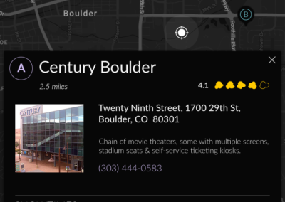
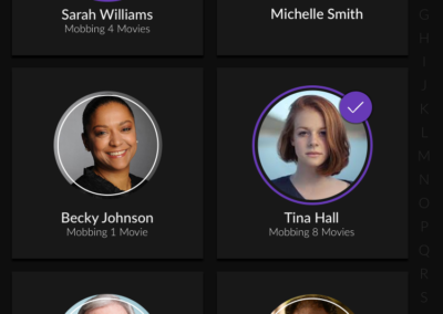
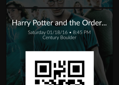
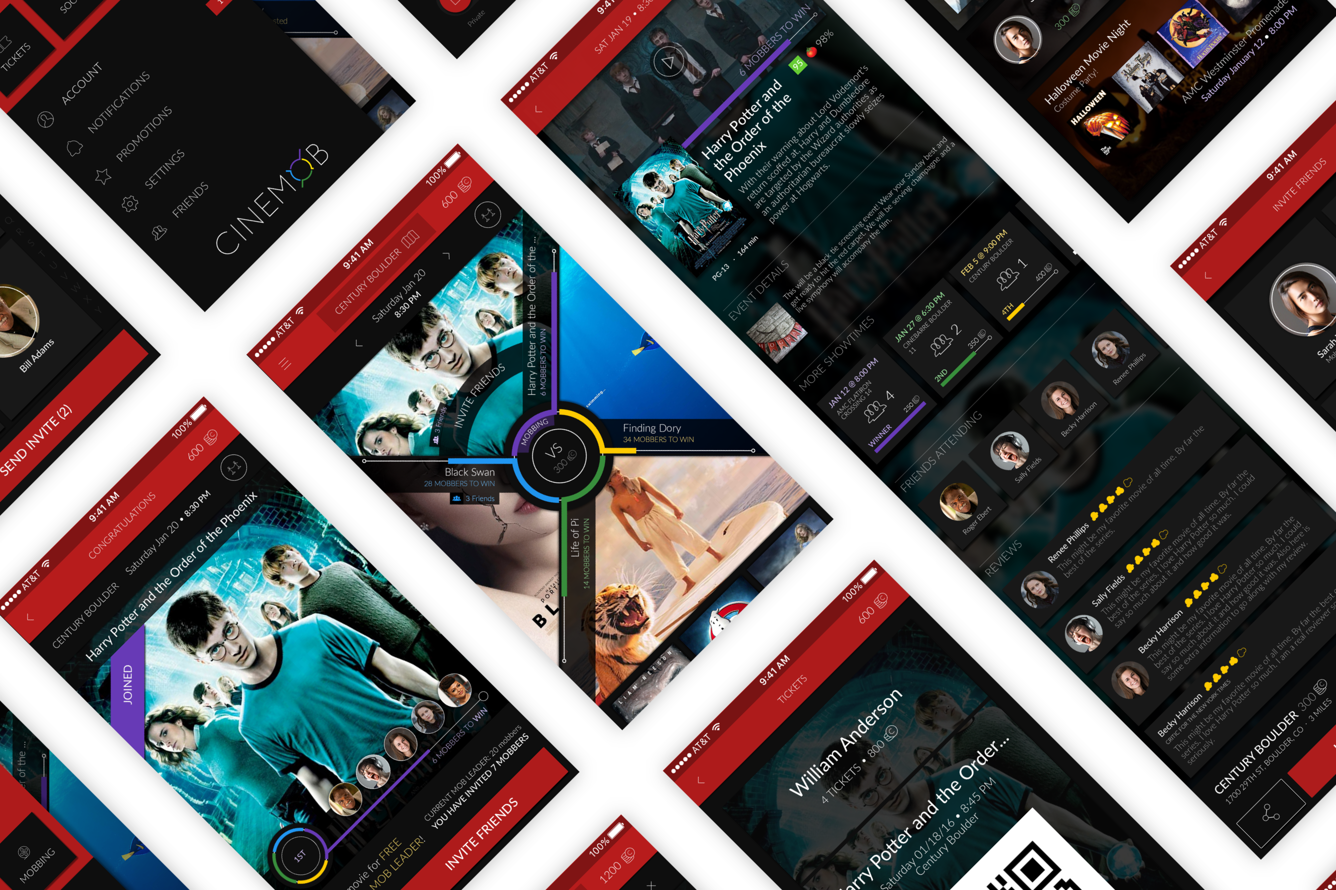
With the branding finalized and the architecture decided, the final step was to build out the UI fully and link it all up in a clickable prototype. In keeping to the nostalgic history of cinema, red was the obvious choice for the primary action color. I worked through a couple different shades of red to pair with the colors in the logo and came to this ruby tone you see in the final product, and placed it all on a dark charcoal background to help promote the mood of an actual theater and to allow the movie posters to shine. Allowing Google’s Material Design guidelines to inform many structural design elements, I was able to ground the novelty of the competition control within a comfortable and expected experience for the user.
explore the prototype here to see the full design, or explore a subset of the screens below.

